Branding for an optometry center in West Nyack, NY.
Graphic Designer
Brand Designer
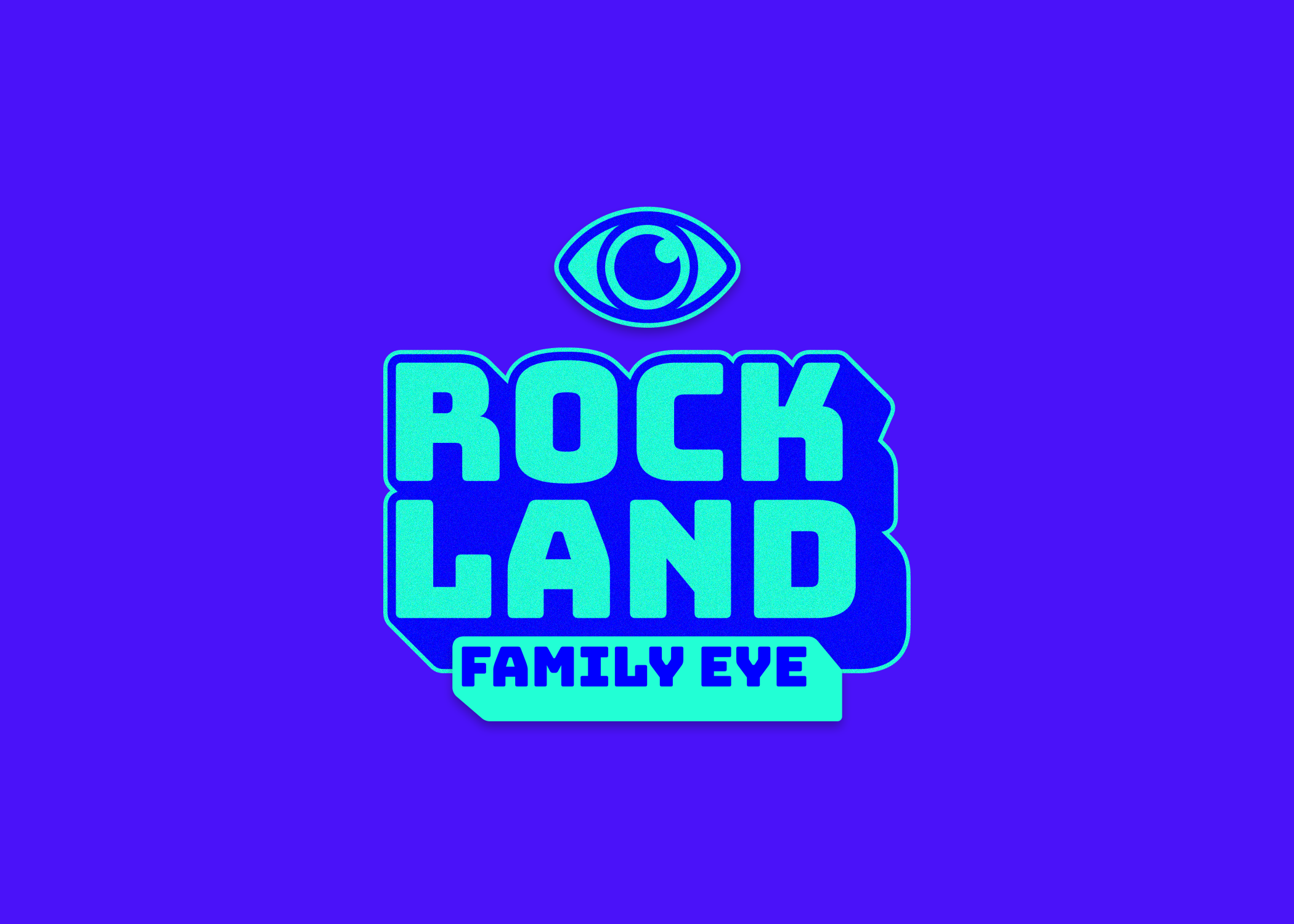
The Rockland Family Eye logo is a captivating blend of retro 80's aesthetics with a subtle touch of cyberpunk, setting it apart in the world of optometry branding. In a departure from traditional eye-centric designs, "ROCK" boldly stretches above "LAND," delivering a dynamic and distinctive visual impact. The retro script of "Family Eye" nestled below adds a nostalgic flair to the overall composition.
A nod to the profession, the "O" and "D" in "Family Eye" are cleverly outlined, creating negative space within and symbolizing the essential "OD" title for optometrists. This intentional design choice not only reinforces the optical focus but also imparts a unique and memorable identity to Rockland Family Eye. The logo's fusion of retro charm and cyberpunk edge promises to make a lasting impression, attracting a diverse clientele seeking a fresh and exciting vision care experience.
approach
goal
challenges
Tasked with creating a unique, cyberpunk-themed logo for Rockland Family Eye that is both readable and resonates with clients.
Solution: Design a logo that balances retro aesthetics with modern readability, ensuring it communicates the business's identity clearly.
Theme vs. Readability: Integrating a cyberpunk theme while maintaining logo clarity and readability.
Client Understanding: Ensuring the logo's meaning is clear to clients unfamiliar with the business.
Research: Studied cyberpunk and retro design elements to gather inspiration.
Sketching: Drafted multiple logo concepts, focusing on the balance between theme and readability.
Design Iteration: Created digital versions, refining details to enhance clarity and aesthetic appeal.
Feedback: Gathered input from stakeholders to ensure the design met business and client expectations.
Finalization: Polished the selected design, ensuring all elements aligned with the brand’s vision.
process
versions

final versions
After much consideration, the Cyberpunk version just wasn’t working due to poor readability of “Family Eye". Redesigned with simpler color scheme and “video game” feel.
-
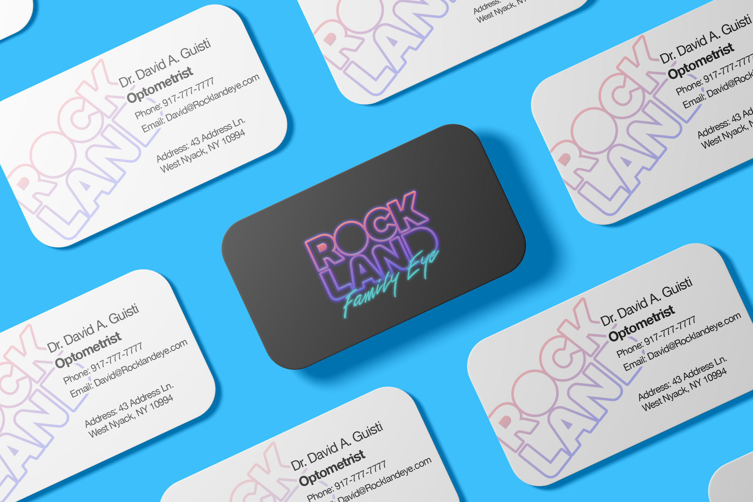
Business Cards
Business Card design for Rockland Family Eye, displaying front and back of cards.
-
Rockland Family Eye Logo
Rockland Family Eye full logo and color.
-

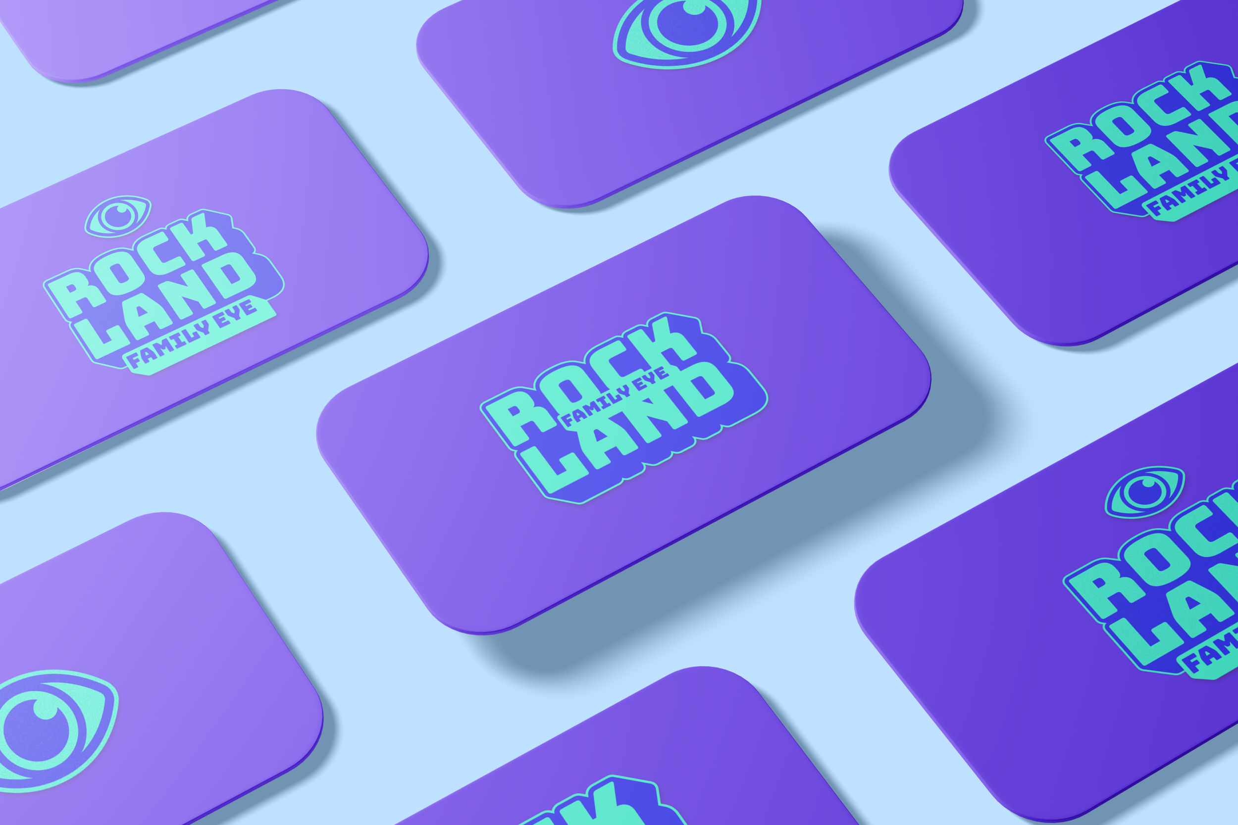
Rockland Logo Standard
Rockland Logo without “Family Eye” - Used primarily for business card companion design.
