
Caulie App Design and User Research
UX DesignerUX ResearchUI DesignBrand DesignGraphic Design
I embarked on creating Caulie, a health app aimed at empowering users to make informed dietary choices. The app utilizes augmented reality and barcode scanning to provide users with detailed information about the ingredients in their food, along with educational content to promote healthier eating habits. Throughout the design process, I focused on blending usability with engaging visuals to create an app that is both informative and enjoyable to use.
the problem
The inspiration behind Caulie stemmed from the need to address the lack of accessible and engaging platforms for learning about food ingredients. Many calorie tracking apps on the market offer limited information and fail to provide users with meaningful insights into the nutritional content of their meals. With Caulie, I aimed to fill this gap by offering a comprehensive solution that combines barcode scanning technology with user-friendly design and educational resources.


brand design
The Caulie logo and mascot play a key role in reinforcing the app's goal of educating users in a fun and engaging way. The logo incorporates playful typography and vibrant colors, while the cute cartoon Cauliflower mascot adds personality and charm to the user experience. Together, they create a cohesive brand identity that resonates with users and encourages them to explore the app's features with enthusiasm.

design system
The design system for Caulie emphasizes simplicity, usability, and consistency. Using greens and purples to evoke health and vitality, the system ensures an intuitive interface with fast barcode scanning and clear ingredient indicators. User feedback and testing were integral in refining the design, making the app both visually appealing and functionally efficient. This comprehensive design system ensures consistency across the app, reducing the effort required to locate content and enhancing the overall user experience.
-
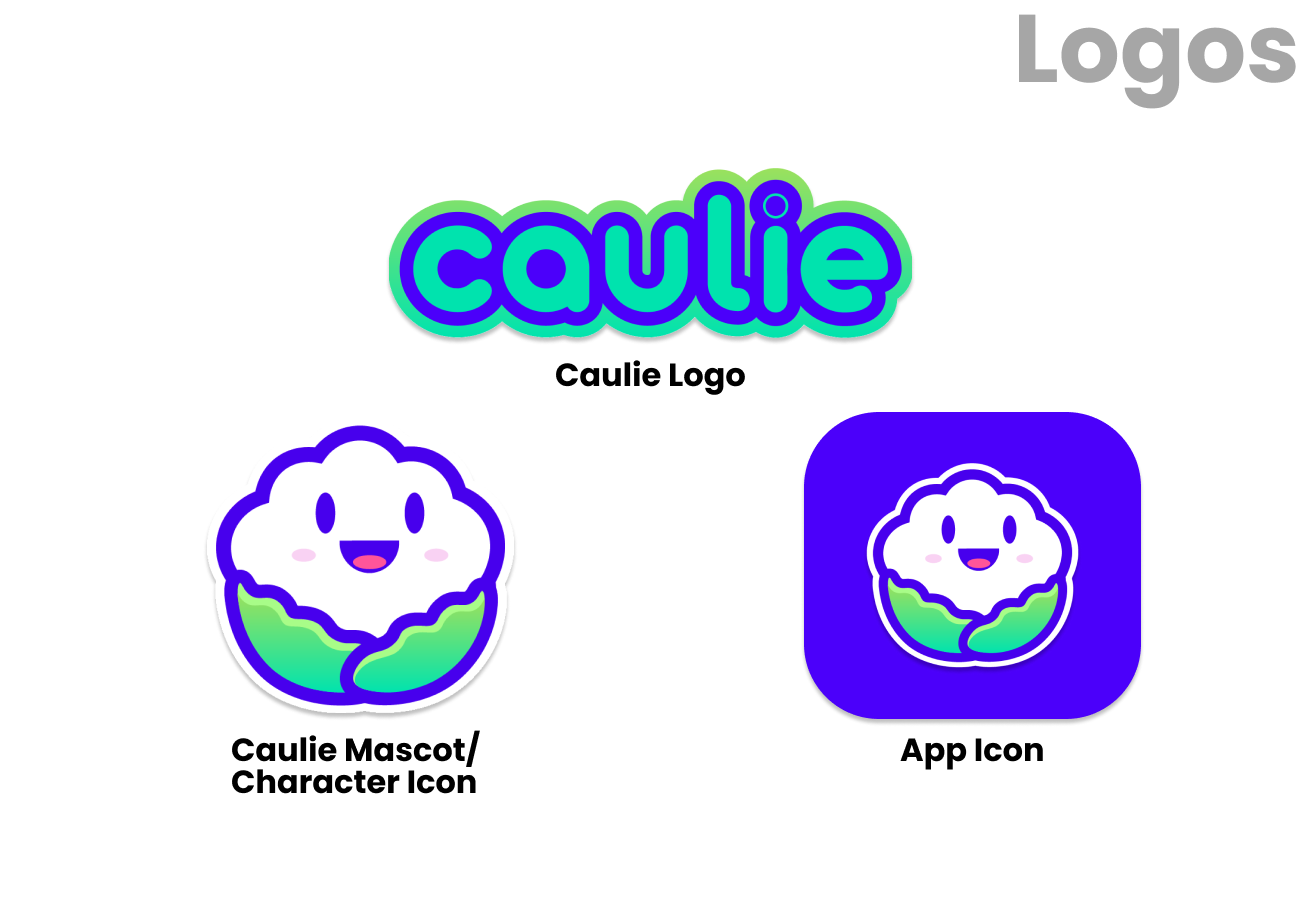
The logos are designed to be clean and simple, with a consistent style that aligns with the overall branding of the app. Each logo variant is tailored for different contexts, ensuring versatility and recognizability.
Consistent and versatile logos help maintain brand identity across various platforms and touchpoints. This consistency reduces the cognitive load on users, making the app more memorable and enhancing brand trust and recognition.
-

The typography choices ensure readability and accessibility, with clear headings and body text that guide users effortlessly through the app.
Consistent typography makes the app look professional and organized, reducing cognitive load and helping users find information quickly.
-
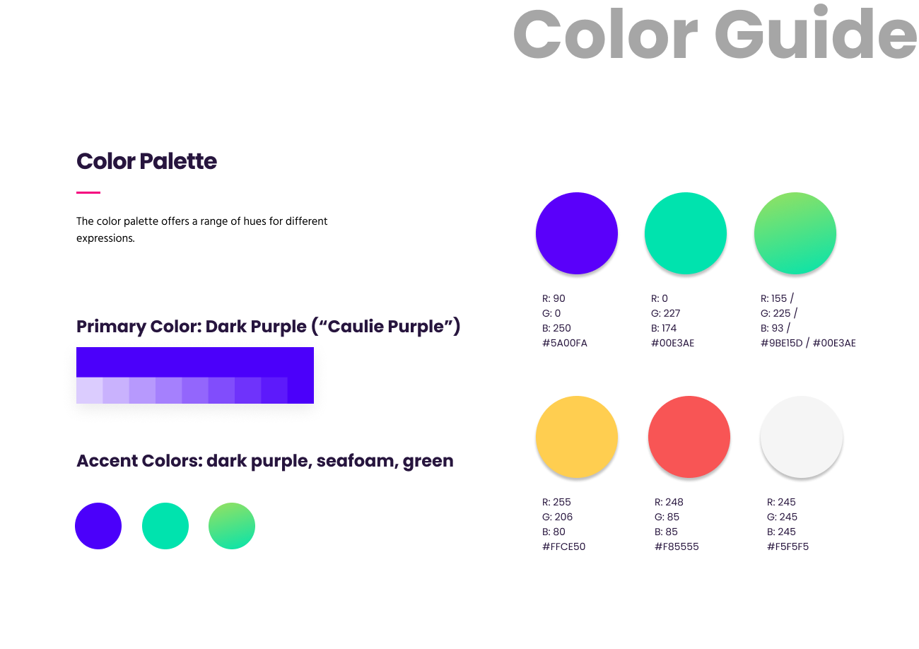
The color palette features greens and purples to evoke health and vitality. These colors create a cohesive look and feel, making the app visually appealing and easy to navigate.
Consistent use of these colors throughout the app helps users quickly associate different sections and functions, enhancing their overall experience.
-

Custom icons are used to represent different actions and features, providing visual cues that are easy to understand.
Icons improve usability by allowing users to recognize actions at a glance, reducing the need for extensive reading and making navigation more intuitive.