Role
Branding
Creative Direction
Thank You Tornado is my own design agency, where I focus on simplistic branding for aspiring entrepreneurs.
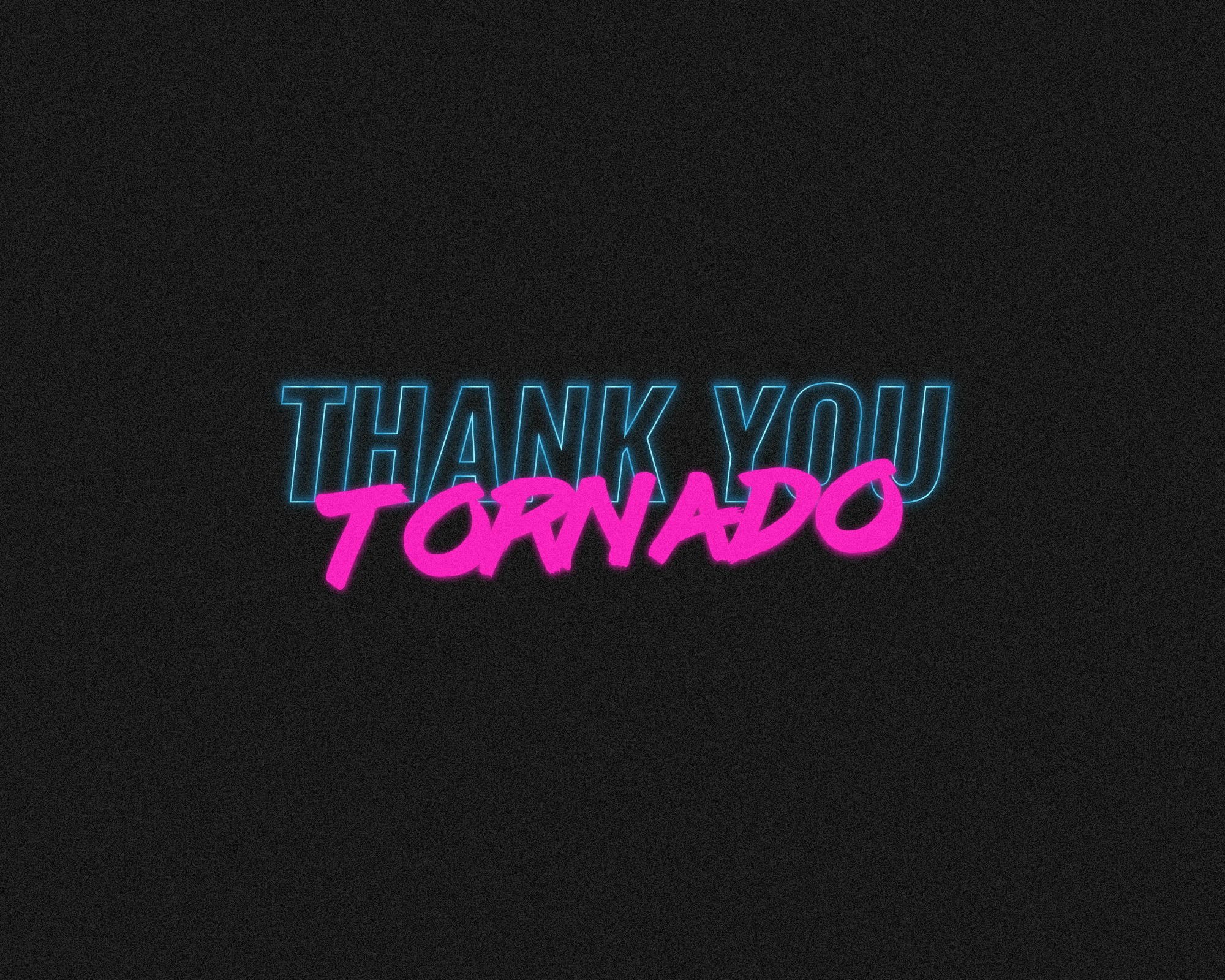
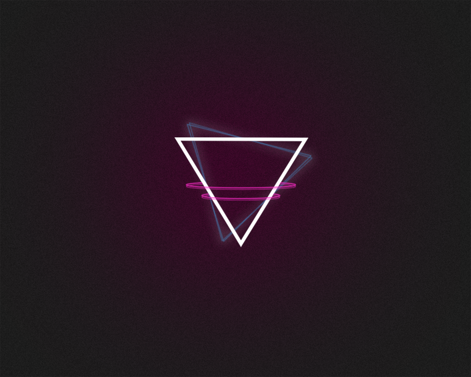
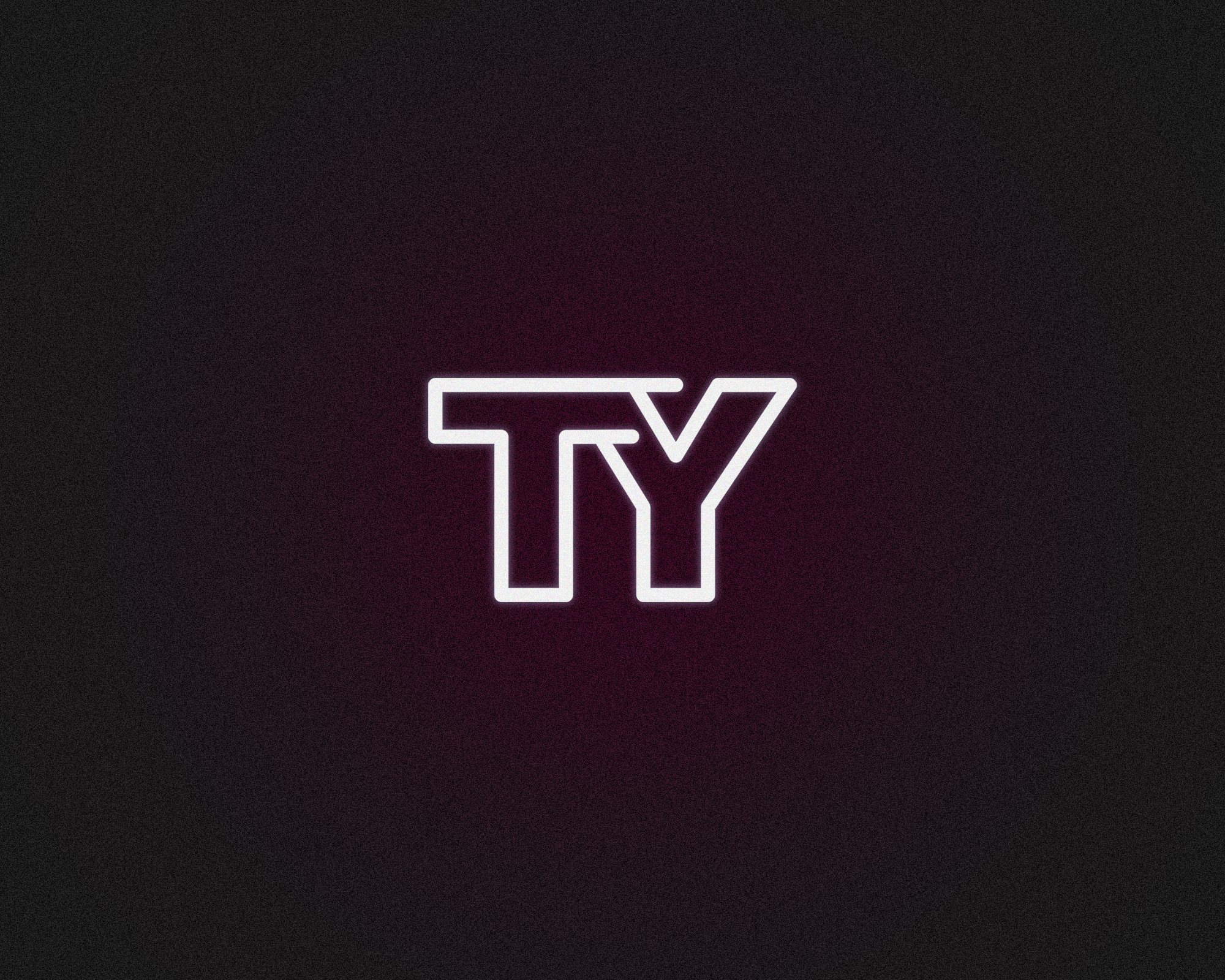
Thank You Tornado is a vibrant fusion of strength, playfulness, and sophisticated design. Unveiling three distinctive logos, the Logotype radiates an 80's outrun aesthetic, embodying power and nostalgia. The Logomark, a sleek tornado graphic, captures the brand's dynamism with minimalistic flair. Completing the trifecta, the Monogram (TY) stands as a symbol of concise elegance.
The essence of Thank You Tornado is where strength meets fun in a design language that is both dynamic and refined.

approach
goal
The goal was to brand 'Thank You Tornado' in a unique and memorable way that highlights the creative services offered, with a distinct retro theme.
challenges
Brand Differentiation: Standing out in a competitive market.
Consistent Retro Theme: Balancing a consistent retro theme with modern appeal.
Client Engagement: Designing engaging elements that attract potential clients.
process
-

Logotype Sketch
Early version sketch of “THANK YOU TORNADO.” The initial idea was to have the logotype and icon match, both featuring "shaking" lines to convey a rough, dynamic feel.
-

Logotype v1
Introduced brand colors hot pink and tornado blue, utilizing negative space and a gradient to give the text an illusion of movement and transformation.
-

Logotype v2
Final version of the THANK YOU TORNADO logotype. Inspired by 80's action/sci-fi logos, I moved "TORNADO" underneath to condense the width and aimed to match the bold attitude and uniqueness of the brand name.
-
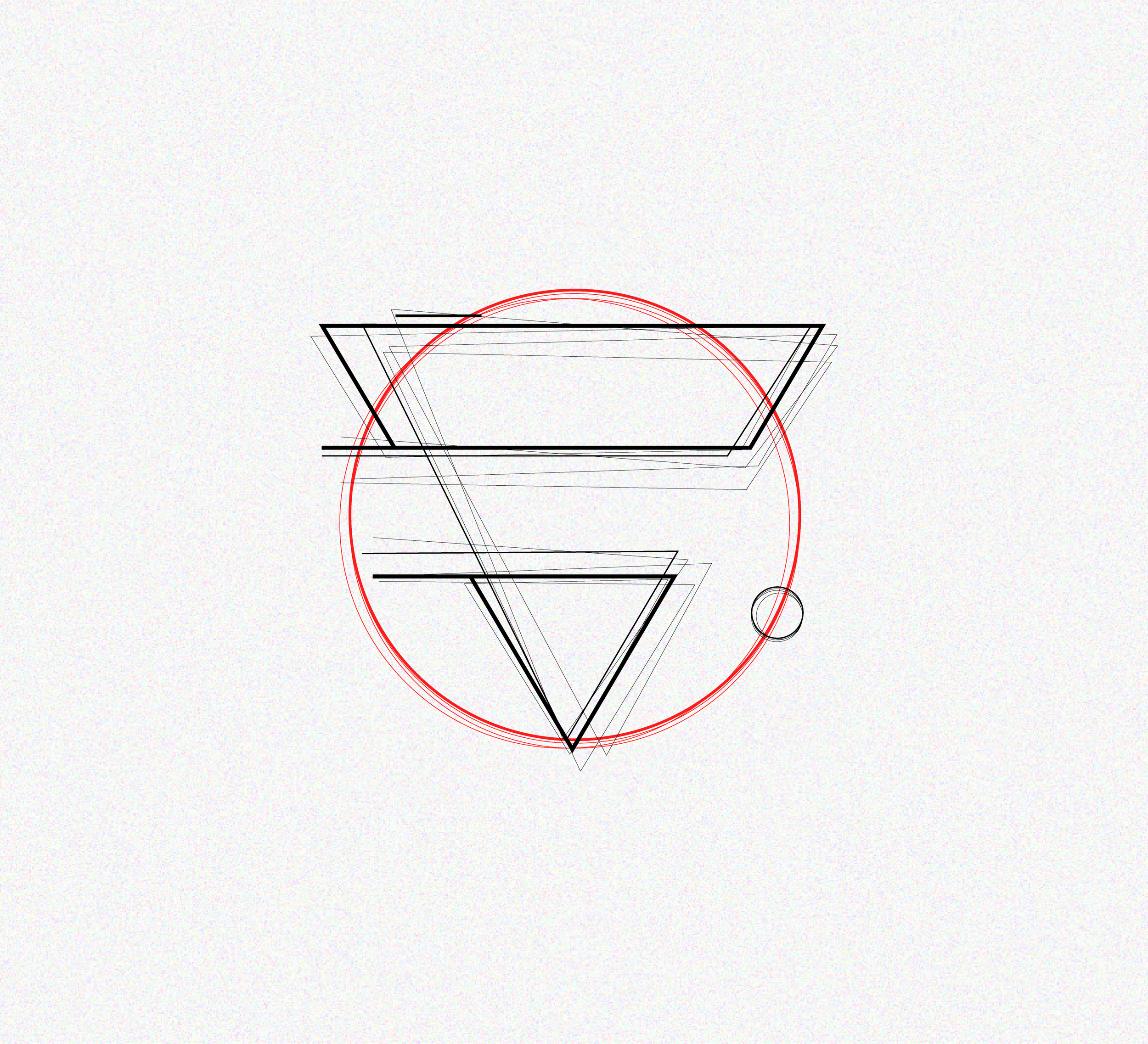
Tornado Icon sketch
In the early version sketch of the tornado, I aimed for a geometric design, experimenting with circles to add character and stability to the chaos.
-

Geometric Tornado v1
I refined the sketch by removing the circles and adding "spin lines" to give the shape a spinning effect. The thin lines were incorporated to simulate the chaotic nature of a tornado.
-
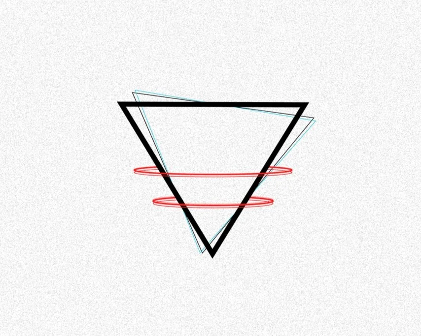
Geometric Tornado v2
The final version of the tornado icon involved simplifying the spin lines and adding a red color to distinguish them from the triangles and add depth. The thin lines behind the thick triangles were intended to convey movement.